
Design + Code
Atlas Dashboard
Redesign Atlas dashboard, a time-and-expense tracking web application for medical providers.


What were the problems?
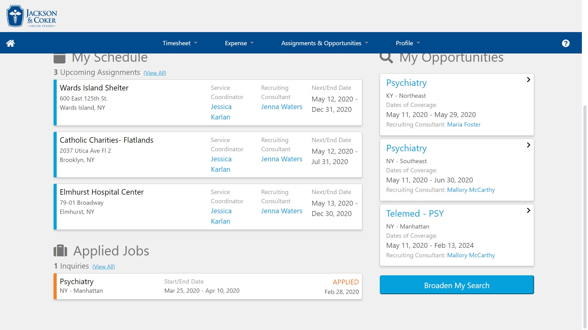
The big problems with the dashboard were glaring: the horizontal navigation was not sustainable for additional links. It was also not responsive across devices. Past due or declined timesheets were not pushed to the front, which means users could go weeks with delayed pay .
Before Desktop 1
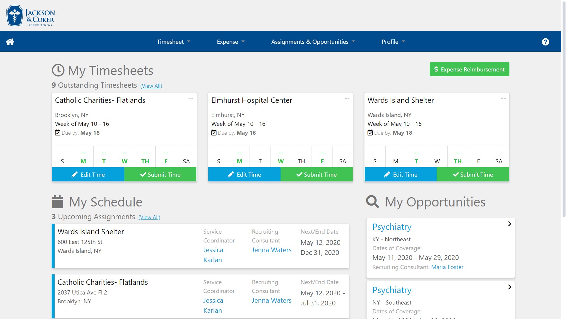
Before Desktop 2
Before Mobile 1
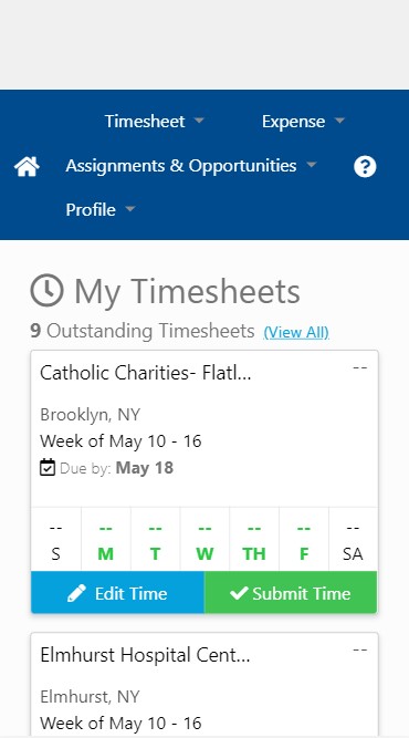
Before Mobile 2
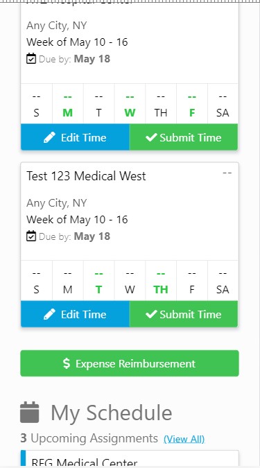
Before Mobile 3
Before Mobile 4
Before Mobile 5
Other issues
- Too many CTA buttons
- Excess details at the dashboard level, which causes the user to scroll far too long on mobile
- No strategic use of the brand’s color palette
- Header is too big
- Not mobile friendly
How Did you Solve It with UX?
To solve some of the big structural problems on our list, I envisioned a dashboard with a vertical navigation. This would:
- Reduce the header
- Create a responsive and adaptive navigation menu
Another change was reducing the cognitive load. There were far too many details present on the page which caused needless scrolling and confusion on what information was the most pressing.
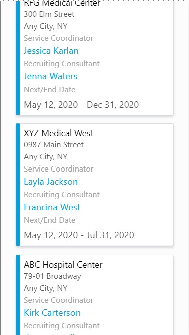
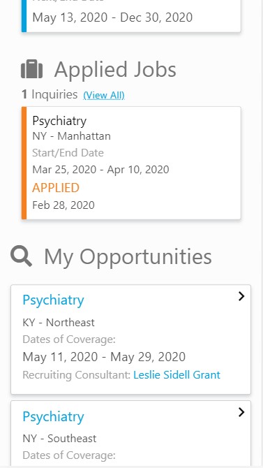
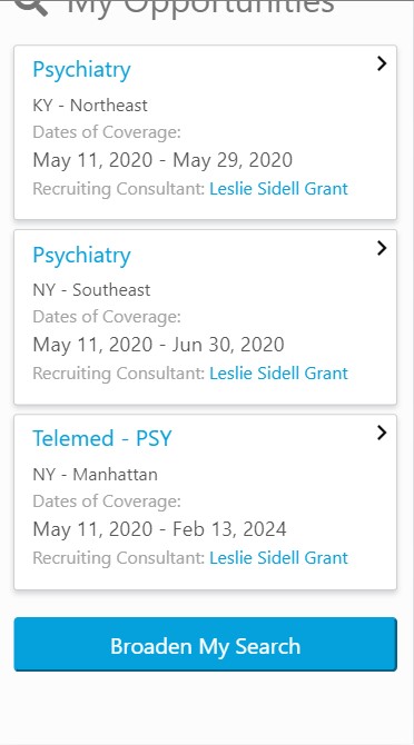
By using progressive disclosure, I redesigned the content using responsive cards from Bootstrap and only showing information that only the user needs to know. This was particularly important in the Time section which was the top function of the Atlas web application. These were the new rules I developed:
- In desktop, no more than 4 current timesheets should appear. When there are more timesheets, a “More” link would become available.
- If there is a single past due or declined timesheet, it will be pushed to the front and indicated in red. This will help the user know that there is a timesheet that needs their IMMEDIATE attention.
- If there are more than one single past due or declined timesheet, they should be “combined” and linked to a page that will show all of the past due timesheets on one page. This will help to prevent an excess of red at the dashboard level, which can be a turn off to healthcare providers.
Other solutions
- To simplify the color palette, I created a design system.
- To reduce the number of CTAs, I adopted progressive disclosure using clickable cards and chevrons to indicate going deeper into a section of the website.
Final Look

What were my contributions?
- Wireframed and prototyped the dashboard design
- Provided the HTML, CSS/SASS, Angular 6 code
- Created the Atlas Design System to help support the look and feel of the dashboard