Design + Code
Atlas Login Password Update
What was the problem?
Users and service coordinators (customer service agents of Atlas) had many complaints regarding the password process on Atlas. In its original configuration, users would enter their password. If it wasn’t correct, the user could continue to make a handful of attempts before being locked out. The only way to amend this would be to call or email a service coordinator to have them manually unlock their account. Alternatively, users could opt to reset their password, but they would be faced with the same issue of having to wait until a service coordinator to complete the password reset process on the backend. This caused frustration with the users and unnecessary busywork for the service coordinator.
My goal was to implement some password UX best practices to help reduce the overall amount of password lockouts and password reset requests.
How Did you Solve It with UX?
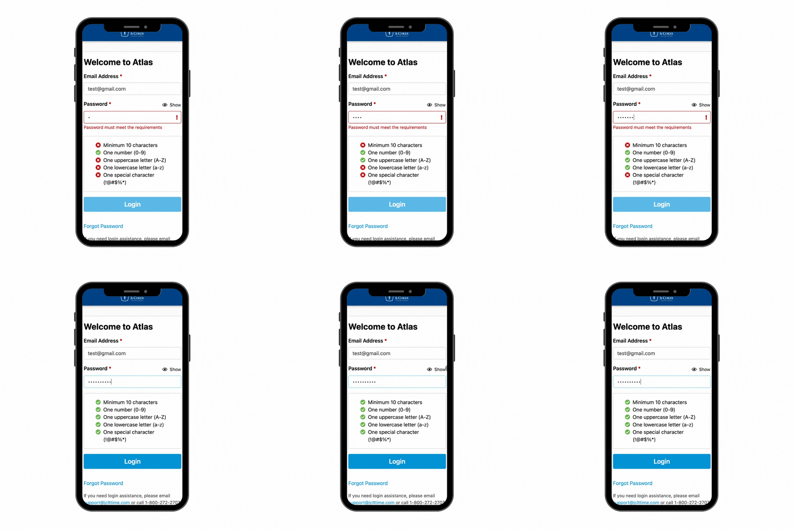
- On focus, an interactive password guideline appears, helping the user remember what constitutes a validated password.
- Added show/hide functionality so users’ can visually see what they are typing as they are entering their password
- The CTA would remain disabled until the user entered a validated email address and password.
- Added clear, concise, meaningful, actionable inline error messages
Reforming Login Inputs
Adding Show/Hide Password Functionality
What was the result?
- Significant increase in users’ successful login attempts
- Happier service coordinators due to reduced number of manual password resets
What were my contributions?
- Wireframed and prototyped the new login page design
- Added more helpful, plain-language inline error message
- Provided the HTML, CSS/SASS, Angular 6 code via the Atlas Design System

