
Code + Design
Color Input Accessibility Badge


What made you build this?
It was a random assignment given to me. The only request was to create something that detected hex color values and supplied data on whether it was accessible against a white background.
What I ended up creating was a reusable component and directive that calculates and supplies keystroke-to-keystroke feedback of the color ratio based on the WCAG Level AA requirements. I utilize key concepts like progressive disclosure and good error handling to help ensure a good user experience. For example, only the most pertinent information is show at the top level. If you hover over the badge, more information is show. Also, I placed mechanisms within the directive so it knows whether you’ve typed a 3-digit or a 6-digit hex color code. It knows when you typed a hex code while surrounded by other text.
I didn’t just finish a task. I created an impressive tool that shows how dedicated and creative I am when it comes to my work.
01
Create an Angular directive that does the following:
- Calculate the luminance between of 2 colors
- Formulate calculation as a ratio
- Determine if ratio meets or fails WCAG Level AA standards for normal or large text
- Display this feedback instantly to the user
import { Directive, ElementRef, OnInit, Input, Renderer2, Output, EventEmitter, OnChanges } from '@angular/core';
import { TransportInputValueService } from '../services/transport-input.data.service';
import { TransportObjectDataService } from '../services/transport-object.data.service';

@Directive({
  selector: '[colorContrast]'
})


export class ColorContrastDirective implements OnInit, OnChanges {

  @Input() userInputValue: string;
  @Input() extractedHexValue: string;
  @Input() basicColorContrast: boolean = false;
  anyHexPattern: any = /#([A-Fa-f0-9]{0,6})/;
  invalidHex: boolean;
  ratio: number;
  @Input() bgColorFromComponent: string;
  @Input() custom: boolean = false;
  formattedRatio: string;
  @Output() colorContrastDetector = new EventEmitter();
  @Output() colorSwitchDetector = new EventEmitter();
  @Input() blackWhiteSwitch: boolean = false;
  aaNormalText: string;
  aaLargeText: string;
  aaaNormalText: string;
  aaaLargeText: string;
  basicColorContrastObject: any = {};
  blackWhiteColorObject: any = {};
  blackRatio: number;
  whiteRatio: number;
  blackPassAANormal: string;
  blackPassAALarge: string;
  whitePassAANormal: string;
  whitePassAALarge: string;
  blackColor = '#000000';
  whiteColor = '#FFFFFF';


  constructor(private _el: ElementRef, private renderer: Renderer2, private transportInputData: TransportInputValueService, private transportObjectData: TransportObjectDataService) {

  }


  ngOnInit() {
  }


  ngOnChanges() {
    if (this.basicColorContrast) {
      if (this.anyHexPattern.test(this.userInputValue)) {
        this.basicColorContrastRatioCalculation();
        this.getColorContrastInfo();
        this.setSharedObject(this.makeOpacityObject())
        console.table(this.getColorContrastInfo())
      }
    }

    if (this.blackWhiteSwitch) {
      this.ratioCalculationForColorSwitchTest(this.blackColor, this.whiteColor)
      this.getBlackWhiteSwitchInfo();
    }

  }


  /* Math for getting color contrast ratio*/

  //Get the luminance of each color hex value
  luminance(r, g, b) {
    let [lumR, lumG, lumB] = [r, g, b].map(component => {
      let proportion = component / 255;

      return proportion <= 0.03928
        ? proportion / 12.92
        : Math.pow((proportion + 0.055) / 1.055, 2.4);
    });

    return 0.2126 * lumR + 0.7152 * lumG + 0.0722 * lumB;
  }


  contrastRatio(luminance1, luminance2) {
    let lighterLum = Math.max(luminance1, luminance2);
    let darkerLum = Math.min(luminance1, luminance2);
    return (lighterLum + 0.05) / (darkerLum + 0.05);
  }


  //Returns the ratio of the two colors
  checkContrast(color1, color2) {
    let [luminance1, luminance2] = [color1, color2].map(color => {
      /* Remove the leading hash sign if it exists */
      color = color.startsWith("#") ? color.slice(1) : color;


      //If hex value is 3 digits, then the value is calculated by doubling each digit
      //I.E. #F6C equal to FF + 66 + CC
      if (color.length === 3) {
        color = color.split('').map(function (hex) {
          return hex + hex;
        }).join('');
      }
      let r = parseInt(color.slice(0, 2), 16);
      let g = parseInt(color.slice(2, 4), 16);
      let b = parseInt(color.slice(4, 6), 16);
      return this.luminance(r, g, b);
    });
    return this.contrastRatio(luminance1, luminance2);
  }

  //Round and format ratio
  formatRatio(ratio) {
    let ratioAsFloat = ratio.toFixed(2);
    return `${ratioAsFloat}:1`
  }


  //Detects any 3 or 6 digit value beginning with a "#" and returns that value
  detectHexValue(originalInputValue) {
    let trackHex = originalInputValue.match(this.anyHexPattern)[0];
    return trackHex
  }

  //Returns whether the there are 5 digits in a hex value
  fiveDigitHexValue(originalInputValue) {
    let hexWithoutHash = originalInputValue.match(this.anyHexPattern)[1];
    return hexWithoutHash.length === 5 ? true : false;
  }

  //Automatically Adds a maxlength of 7 to an input if the first character of an input is a '#'.
  addMaxlength() {
    let hash = '#';
    if (this.userInputValue.indexOf(hash) === 0) {
      this._el.nativeElement.setAttribute('maxlength', '7');
    }
  }

  /*Basic Color Contrast Ratio Calculation
  Will run two colors through the color contrast calulation to produce a ratio.
  this function returns an object that includes the input value, extracted hex value, whether the input value is invalid, formatted ratio, background color,
  and whether the ratio passes AA Normal or Large. The object is what is emitted to your component*/
  basicColorContrastRatioCalculation() {
    this.addMaxlength();
    this.extractedHexValue = this.detectHexValue(this.userInputValue);
    this.ratio = this.checkContrast(this.extractedHexValue, this.bgColorFromComponent);
    this.formattedRatio = this.formatRatio(this.ratio);


    /*Uncomment this if you want to include WCAG Level AAA*/
    //this.aaaNormalText = ratio > 7 ? 'PASS': 'FAIL';
    //this.aaaLargeText = ratio > 4.5 ? 'PASS': 'FAIL';

    const object = {
      basicColorContrast: this.basicColorContrast,
      inputValue: this.userInputValue, //user entered value
      extractedHexValue: this.extractedHexValue, //takes the input value and only extract the hex value
      invalidHex: this.fiveDigitHexValue(this.userInputValue) || this.formattedRatio == 'NaN:1', //Detects if the input value is 5 digits OR not a number
      formattedRatio: this.formattedRatio, // Produces the ratio in a formatted fashion (i.e. "21.00:1")
      backgroundColor: this.bgColorFromComponent, //Background Color From the Component
      aaNormalText: this.ratio > 4.5 ? 'PASS' : 'FAIL', //Computes the ratio of two colors against the Level AA normal text standard of 4.5
      aaLargeText: this.ratio > 3 ? 'PASS' : 'FAIL', //Computes the ratio of two colors against the Level AA large text standard of 4.5

    }


    return this.basicColorContrastObject = object;
  }


  /* Event Emitter that will take the object on line 135 and send it to the component where the directive is called*/
  getColorContrastInfo() {
    this.colorContrastDetector.emit(this.basicColorContrastObject)
  }

  /* This function runs both black and white against the hex value in the input field. It is designed
  to default to black. This means that black will be tested first for PASS or FAIL. If it passes, black will be the selected color regardless if
  it also passes for white. White will only be selected if black fails.
  This function returns an object that will be emitted via the Event Emitter*/
  ratioCalculationForColorSwitchTest(blackColor, whiteColor) {
    this.addMaxlength();
    this.blackRatio = this.checkContrast(this.userInputValue, blackColor);
    this.whiteRatio = this.checkContrast(this.userInputValue, whiteColor);
    this.blackPassAANormal = (this.blackRatio > 4.5) ? 'PASS' : 'FAIL';
    this.whitePassAANormal = (this.whiteRatio > 4.5) ? 'PASS' : 'FAIL';
    this.blackPassAALarge = (this.blackRatio > 3) ? 'PASS' : 'FAIL';
    this.whitePassAALarge = (this.whiteRatio > 3) ? 'PASS' : 'FAIL';

    const object = {
      blackWhiteSwitch: this.blackWhiteSwitch,
      inputValue: this.userInputValue, //user entered value
      extractedHexValue: this.detectHexValue(this.userInputValue), //extracted hex value from user entered text
      formattedRatio: (this.blackPassAANormal === 'PASS') ? this.formatRatio(this.blackRatio) : (this.whitePassAANormal === 'PASS') ? this.formatRatio(this.whiteRatio) : this.formatRatio(this.blackRatio), // Produces the ratio in a formatted fashion (i.e. "21.00:1")
      aaNormalText: (this.blackPassAANormal === 'PASS') ? this.blackPassAANormal : (this.whitePassAANormal === 'PASS') ? this.whitePassAANormal : this.blackPassAANormal,
      aaLargeText: (this.blackPassAALarge === 'PASS') ? this.blackPassAALarge : (this.whitePassAALarge === 'PASS') ? this.whitePassAALarge : this.blackPassAALarge,
      ratioAgainstBlack: this.formatRatio(this.blackRatio),  //runs the ratio between the user entered value and the color black
      ratioAgainstWhite: this.formatRatio(this.whiteRatio), //runs the ratio between the user entered value and the color white
      aaNormalTextForBlack: this.blackPassAANormal, //reports if the ratio against black has passed or not
      aaNormalTextForWhite: this.whitePassAANormal, //reports if the ratio against white has failed or not
      passForBlackAndWhite: (this.blackPassAANormal === 'PASS' && this.whitePassAANormal === 'PASS') ? true : false, //reports if the user entered value passes both black and white
      contrastingTextColor: (this.blackPassAANormal === 'PASS') ? this.blackColor : (this.whitePassAANormal === 'PASS') ? this.whiteColor : this.blackColor, //reports the contrasting text color for the user entered value, assumes that black is the default, so the only way white appears is if black fails

    }
    return this.blackWhiteColorObject = object

  }


  /* Event Emitter that will take the object on line 165 and send it to the component where the directive is called*/
  getBlackWhiteSwitchInfo() {
    this.colorSwitchDetector.emit(this.blackWhiteColorObject);
  }

  //Creates a smaller object for the <app-color-input> opacity inputs
  makeOpacityObject() {
    const object = {
      extractedHexValue: this.basicColorContrastRatioCalculation().extractedHexValue, //takes the input value and only extract the hex value
      invalidHex: this.basicColorContrastRatioCalculation().invalidHex, //Detects if the input value is 5 digits OR not a number
    }

    return object
  }

  //Sends object to transport object service
  setSharedObject(object) {
      this.transportObjectData.storePassedObject(object);
  }


}
02
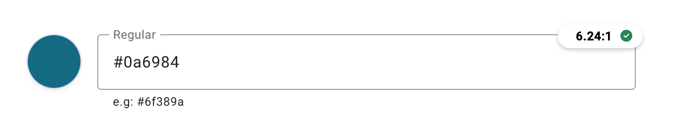
Now lets add the directive to an input. Then, to show that we can display the ratio calculation, lets create a small circular badge to place on the right hand corner of the input.
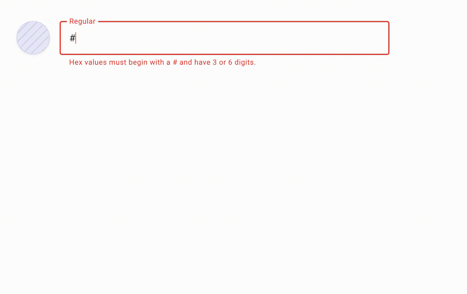
<mat-form-field appearance="outline">
    <mat-label>{{ inputTitle }}</mat-label>
    <input
        colorContrast
        [pattern]="colorContrastPattern"
        [userInputValue]="colorFormControl.value"
        (colorContrastDetector)="colorInputObjectEE($event)"
        [basicColorContrast]="colorFormControl.value"
        [bgColorFromComponent]="backgroundColor"
        type="text"
        matInput
        id="ColorInput"
        formControlName="colorFormControl"
        (focus)="addPrefix()"
        (ngModelChange)="colorChange()"
    />
    <mat-hint *ngIf="!colorFormControl.errors?.['pattern'] && !disabled">e.g: #6f389a</mat-hint>
    <mat-error *ngIf="colorFormControl.errors?.['pattern']">Hex values must begin with a # and have 3 or 6 digits.</mat-error>

    <!-- ACCESSIBILITY BADGE -->
    <!-- Popup Button -->
    <div #label *ngIf="!colorInputObject.invalidHex && addBadge">
        <popup-button [popup]="colorContrastBandCContent" [canCopy]="false" [label]="label" [customPopupButtonType]="'inputBadgeRight'" [customOverlayClass]="'w-75'">
            <input-badge-button [colorContrastObject]="colorInputObject"></input-badge-button>
        </popup-button>
    </div>
</mat-form-field>
<div class="input-badge-button">
    <span class="mx-2">{{colorContrastObject.formattedRatio}}</span>
    <i class="fas fa-check-circle text-success" *ngIf="completePass() && !partialFailure()"></i>
    <i *ngIf="partialFailure()" class="fas fa-exclamation-circle text-danger"></i>
</div>
03
What if we wanted to display even more detailed information?
I added a hover box that shows the following information:
- Typed Color
- Background Color
- Contrast Ratio
- Pass/Fail Status
- Level AA Pass/Fail Status for Normal Text
- Level AA Pass/Fail Status for Large Text
- Explanation of what triggers a pass/fail status for each text
<mat-form-field appearance="outline">
    <mat-label>{{ inputTitle }}</mat-label>
    <input
        colorContrast
        [pattern]="colorContrastPattern"
        [userInputValue]="colorFormControl.value"
        (colorContrastDetector)="colorInputObjectEE($event)"
        [basicColorContrast]="colorFormControl.value"
        [bgColorFromComponent]="backgroundColor"
        type="text"
        matInput
        id="ColorInput"
        formControlName="colorFormControl"
        (focus)="addPrefix()"
        (ngModelChange)="colorChange()"
    />
    <mat-hint *ngIf="!colorFormControl.errors?.['pattern'] && !disabled">e.g: #6f389a</mat-hint>
    <mat-error *ngIf="colorFormControl.errors?.['pattern']">Hex values must begin with a # and have 3 or 6 digits.</mat-error>

    <!-- ACCESSIBILITY BADGE -->
    <!-- Popup Button -->
    <div #label *ngIf="!colorInputObject.invalidHex && addBadge">
        <popup-button [popup]="colorContrastBandCContent" [canCopy]="false" [label]="label" [customPopupButtonType]="'inputBadgeRight'" [customOverlayClass]="'w-75'">
            <input-badge-button [colorContrastObject]="colorInputObject"></input-badge-button>
        </popup-button>
    </div>
    <!-- Newly Added: Popup Content -->
    <ng-template #colorContrastBandCContent>
        <popup-content [customPopupContentType]="'inputBadgeRight'">
            <input-badge-content class="p-3" [colorContrastObject]="colorInputObject"></input-badge-content>
        </popup-content>
    </ng-template>
</mat-form-field>
04 - First Expansion of Newly Created Component
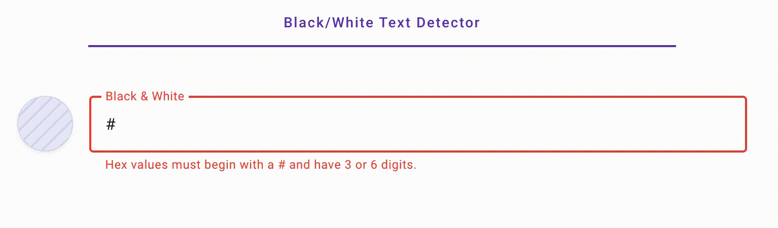
What if we could use a new color detector to tell us if we should use black text or white text?
By retooling my Angular directive to run the typed valid hex color against black (#000) and (#fff) and determining
through a series of if statements which color to display, we get our first extension of our brand new reusable component.
 /* This function runs both black and white against the hex value in the input field.
It is designed to default to black. This means that black will be tested first for PASS or FAIL.
If it passes, black will be the selected color regardless if it also passes for white.
White will only be selected if black fails. This function returns an object that will be emitted via the Event Emitter*/
ratioCalculationForColorSwitchTest(blackColor, whiteColor) {
    this.addMaxlength();
    this.blackRatio = this.checkContrast(this.userInputValue, blackColor);
    this.whiteRatio = this.checkContrast(this.userInputValue, whiteColor);
    this.blackPassAANormal = (this.blackRatio > 4.5) ? 'PASS' : 'FAIL';
    this.whitePassAANormal = (this.whiteRatio > 4.5) ? 'PASS' : 'FAIL';
    this.blackPassAALarge = (this.blackRatio > 3) ? 'PASS' : 'FAIL';
    this.whitePassAALarge = (this.whiteRatio > 3) ? 'PASS' : 'FAIL';

    const object = {
      blackWhiteSwitch: this.blackWhiteSwitch,
      inputValue: this.userInputValue, //user entered value
      extractedHexValue: this.detectHexValue(this.userInputValue), //extracted hex value from user entered text
      formattedRatio: (this.blackPassAANormal === 'PASS') ? this.formatRatio(this.blackRatio) : (this.whitePassAANormal === 'PASS') ? this.formatRatio(this.whiteRatio) : this.formatRatio(this.blackRatio), // Produces the ratio in a formatted fashion (i.e. "21.00:1")
      aaNormalText: (this.blackPassAANormal === 'PASS') ? this.blackPassAANormal : (this.whitePassAANormal === 'PASS') ? this.whitePassAANormal : this.blackPassAANormal,
      aaLargeText: (this.blackPassAALarge === 'PASS') ? this.blackPassAALarge : (this.whitePassAALarge === 'PASS') ? this.whitePassAALarge : this.blackPassAALarge,
      ratioAgainstBlack: this.formatRatio(this.blackRatio),  //runs the ratio between the user entered value and the color black
      ratioAgainstWhite: this.formatRatio(this.whiteRatio), //runs the ratio between the user entered value and the color white
      aaNormalTextForBlack: this.blackPassAANormal, //reports if the ratio against black has passed or not
      aaNormalTextForWhite: this.whitePassAANormal, //reports if the ratio against white has failed or not
      passForBlackAndWhite: (this.blackPassAANormal === 'PASS' && this.whitePassAANormal === 'PASS') ? true : false, //reports if the user entered value passes both black and white
      contrastingTextColor: (this.blackPassAANormal === 'PASS') ? this.blackColor : (this.whitePassAANormal === 'PASS') ? this.whiteColor : this.blackColor, //reports the contrasting text color for the user entered value, assumes that black is the default, so the only way white appears is if black fails

    }
    return this.blackWhiteColorObject = object

  }
05 - Second Expansion of Component
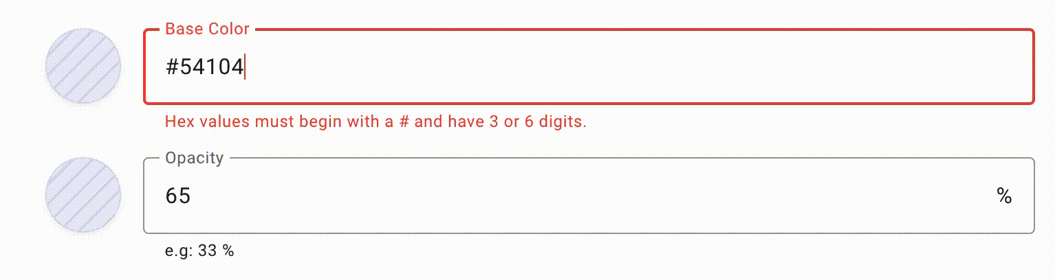
The 2nd expansion comes with the idea of a user’s opacity. So I created a feature for two color input components to communicate with each other: one providing the base color and another one providing the opacity that manipulates the base color.
<div class="row my-5">
    <div class="col-lg-6 mx-auto">
        <div class="mb-3">
            <!-- Base Color -->
            <app-color-input
             [disabled]="false"
             [slimColorInput]="true"
             [smallThumbnail]="true"
             [inputTitle]="'Base Color'"
             [backgroundColor]="'#ffffff'"
             [colorValue]="opacityBaseColor">
          </app-color-input>
        </div>
        <!-- Opacity Controller -->
        <app-color-input
            [receivedInputValueService]="true"
            [disabled]="false"
            [addPercent]="true"
            [opacityColorInput]="true"
            [smallThumbnail]="true"
            [inputTitle]="'Opacity'"
            [baseColor]="opacityBaseColor"
            [colorValue]="'63'"
        ></app-color-input>
    </div>
</div>
What were my contributions?
- Provided all code
Came up with the design and thought process behind the design